
Waiting for the Dulux and Pantone colours of the year has become something of pre-Christmas treat for me! So I was thrilled when they both recently announced their trend forecasts for 2022.
This year Dulux colour experts have considered the global design trends and translated it into the shade Bright Skies. Without a doubt a shade of blue, a light, airy fresh tone that according to Dulux ‘opens up and breathes new life into any space’.
After almost two years of multiple lockdowns the colour has been designed to give us hope of more freedom as we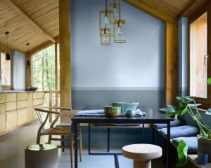 move into 2022. They go on to explain that this year they have very much considered the expanding role of our homes, the essential role nature plays in our lives, the comfort that art brings and the need to embrace a brighter future. They believe Bright Skies is an optimistic blue, good for the soul and transforms spaces into a restorative escape from life’s stresses. It is a shade that brings a hint of the natural world inside and a colour that pairs well with many other shades, from soft neutrals to joyous bright colours.
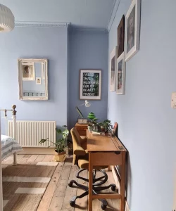
Design experts believe the colour is perfect for small rooms and looks best on the ceiling! It is what is known as a receding colour which means it looks further away from us, therefore making a small space feel bigger. It seems in 2022 we will be bringing more than just the greenery of plants into our homes but the sky too! It certainly gives us all a shot of blue sky optimism!
And then there is the Pantone 2022 colour of the year. Their choice, Very Peri, (definitely purple but described by some as a happy and warm blue!) is said to have a courageous presence that encourages personal inventiveness and 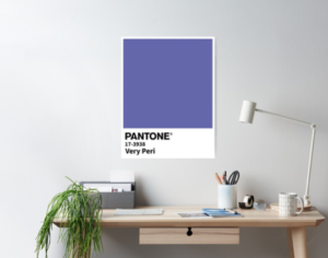 creativity. For the first time Pantone have created a brand new colour. Pantone explain that the colour will help us to embrace these changing times and will open us up to a new vision to rewrite our lives. Very Peri is thought to look beyond the isolation and uncertainty of the pandemic and to the changes coming upon us in the world.
The colour is believed to rekindle gratitude for some of the qualities of blue but is complemented with its violet red undertone to give a new perspective for today and the future. Pantone explain that the colour choice has been influenced by the digital world and the popularity of a metaverse, illustrating the fusion of modern life and colour in the digital world. They believe it delivers an empowering mix of newness with a carefree confidence.
So whilst the colour is clearly purple its routes are taken from qualities of blue and some in some ways both Dulux and Pantone has a common ground with their selections this year. Certainly their sentiments of courage, imagination, hope and optimism relate.
What do you think? Which is your favourite?
Images by Dulux and Pantone